Google Fiber
illustration
illustration
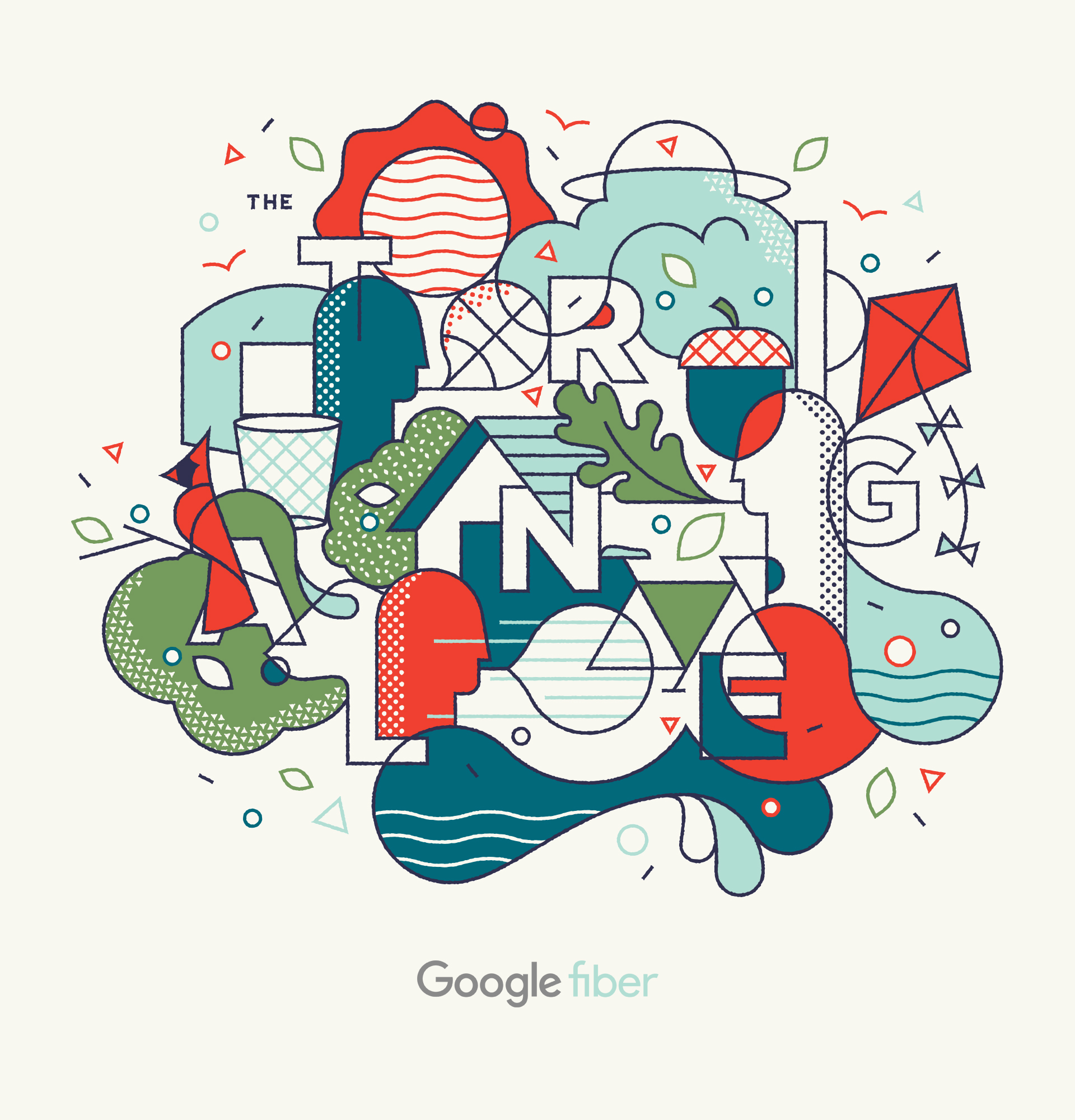
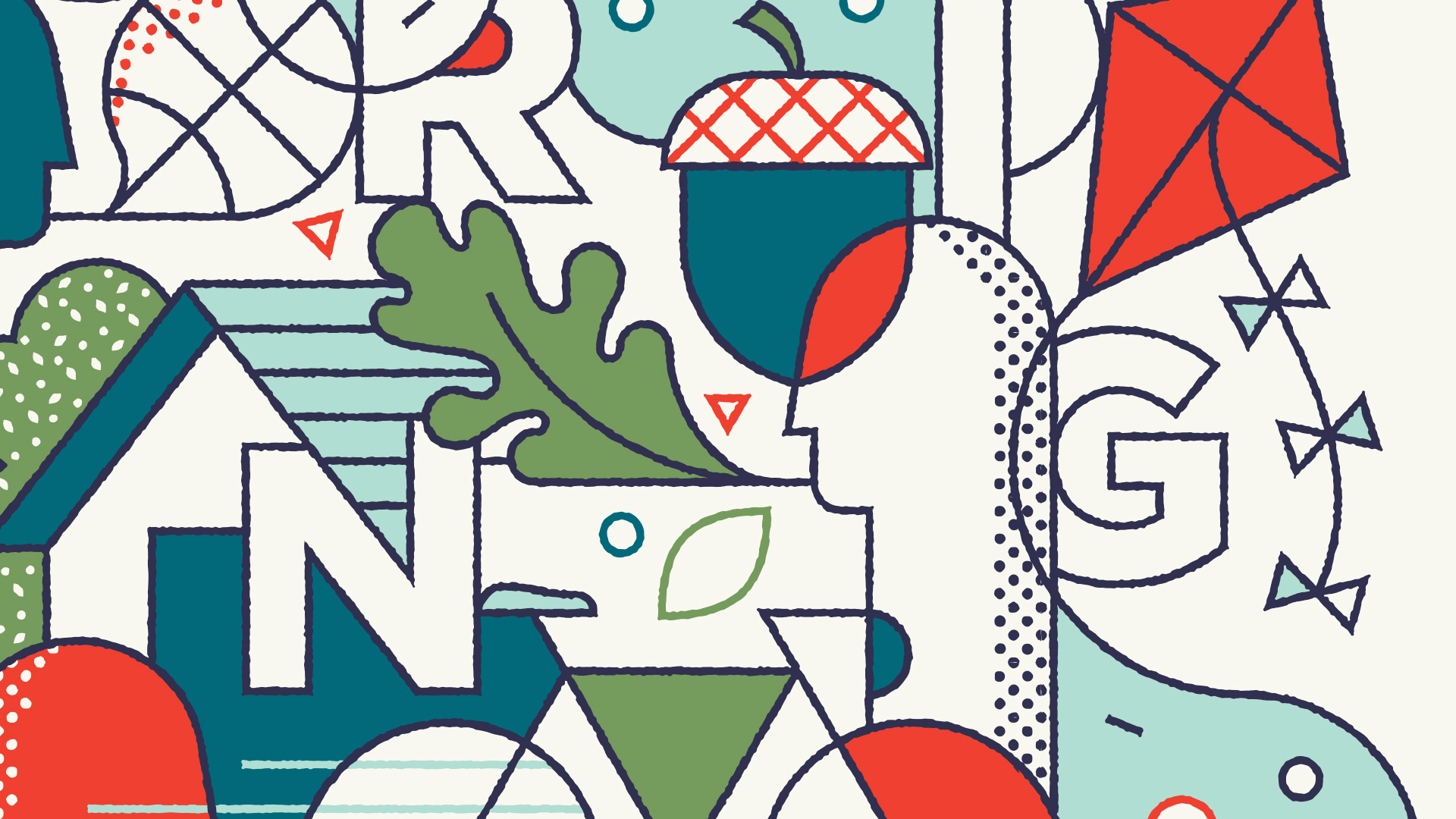
Google Fiber needed a friendly introduction to its new neighborhood, the triangle. This illustration draws inspiration from city symbols and nicknames to create something that feels unique to the area.


UNCSA
Branding
Branding
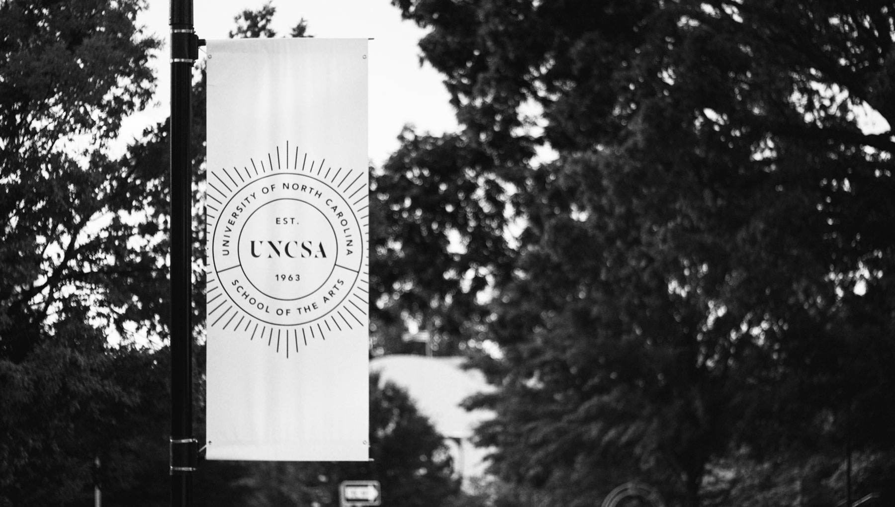
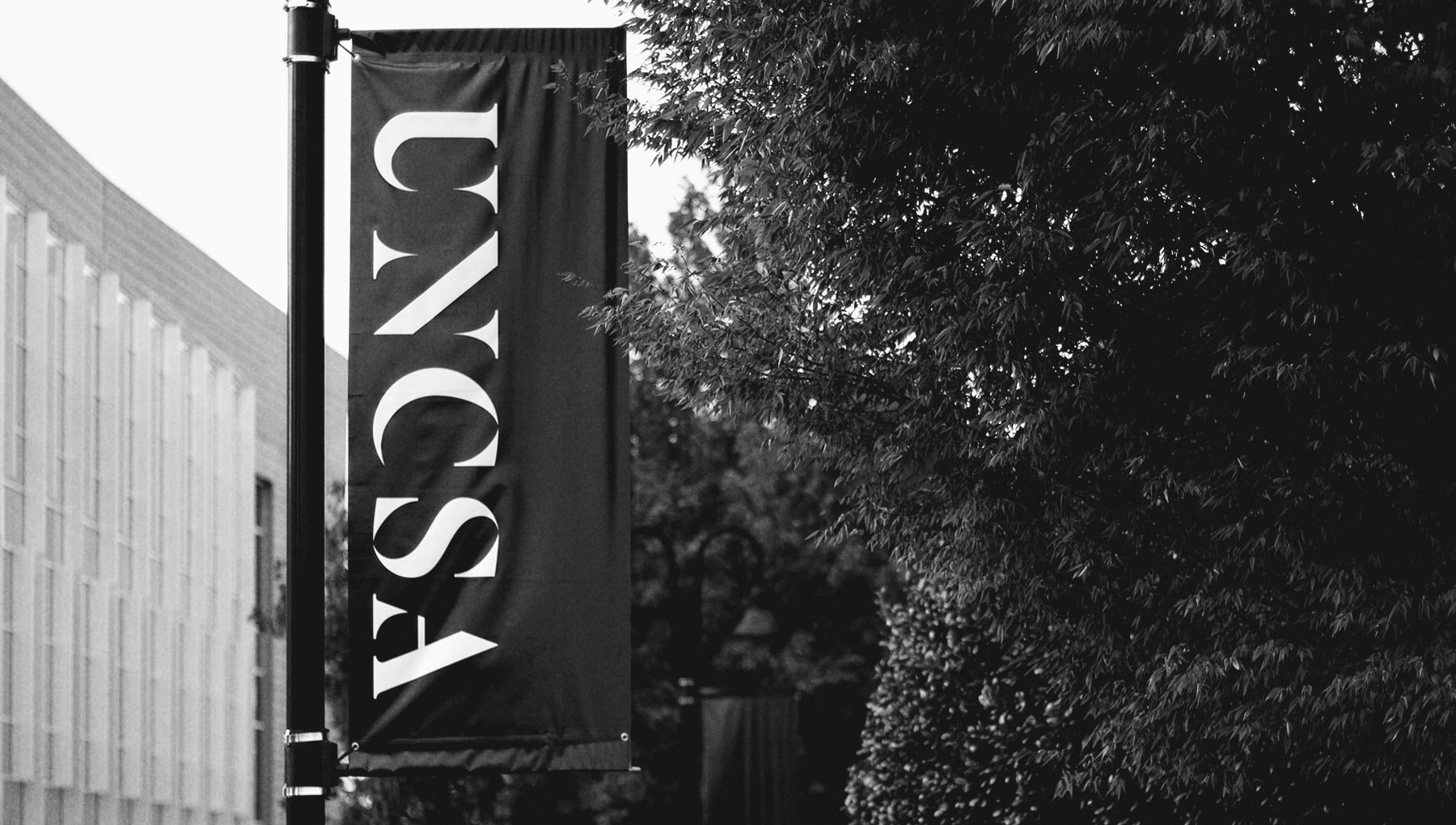
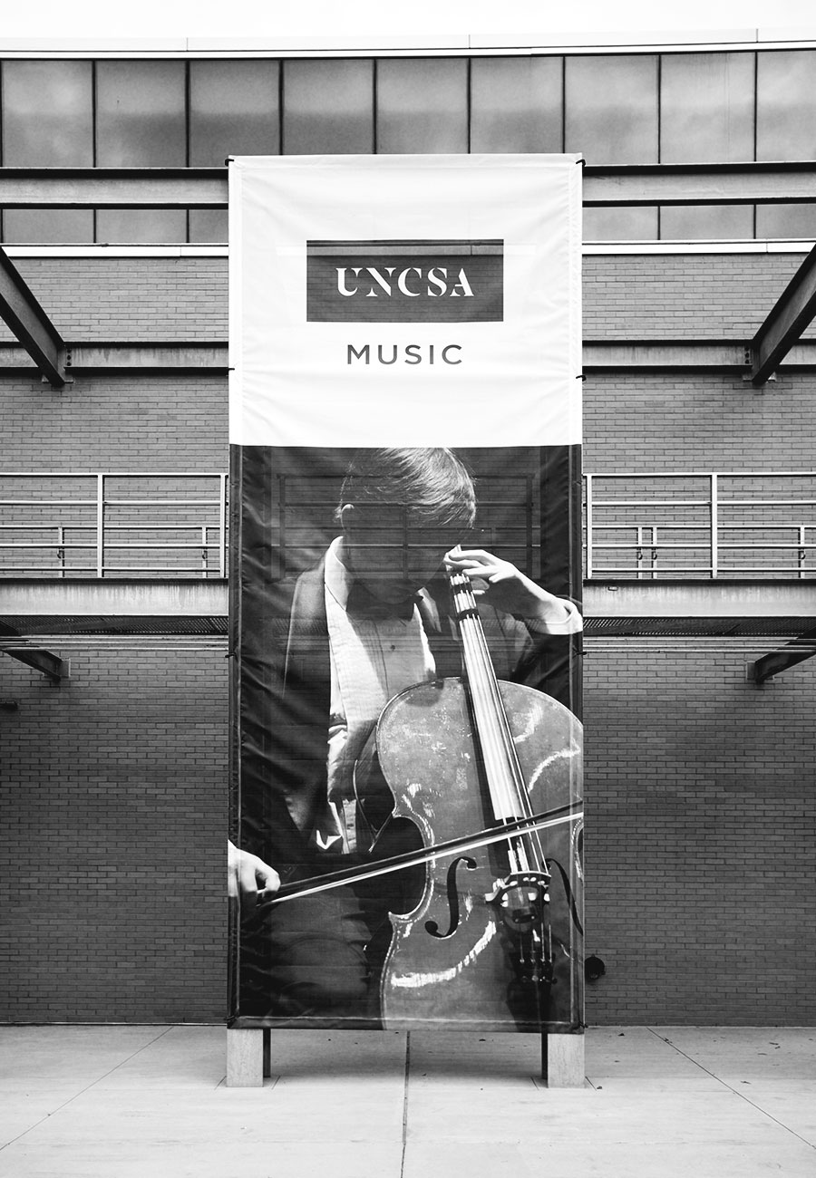
THe university of north carolina School of the arts needed a logo that showed unity and forward thinking while also keeping its rich history of being the United state’s first ever public arts conservatory.






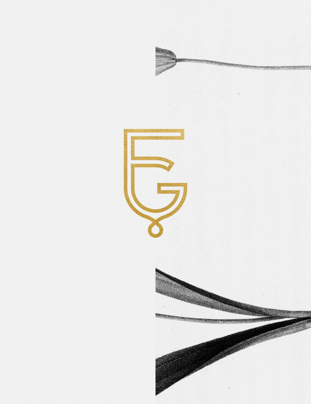
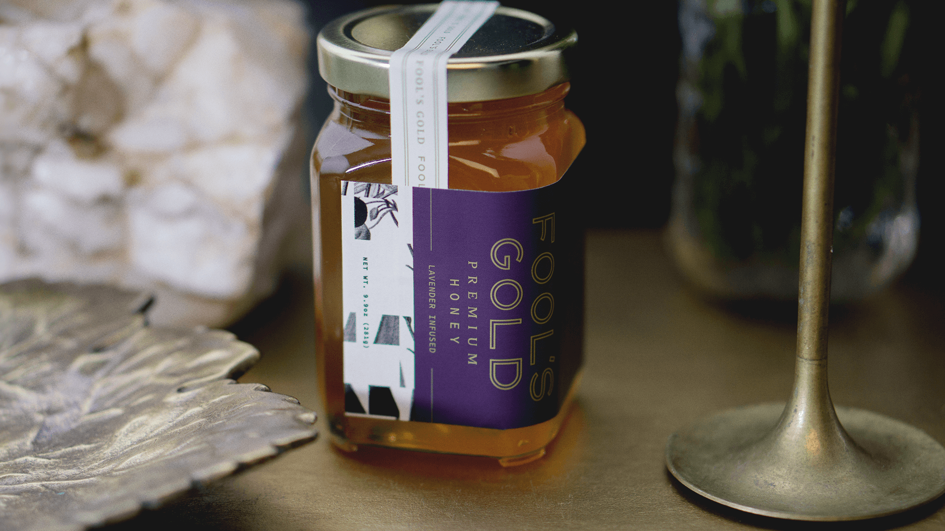
Fool’s Gold
Branding & Packaging
Branding & Packaging
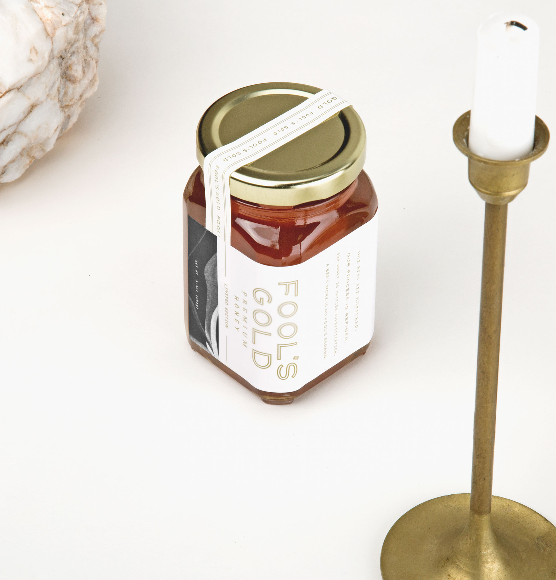
From its Mismatched type combinations to its imperfect but endearing patterns, fool’s gold is here to embrace foolishness.
This project was featured on Mindsparkle Mag
This project was featured on Mindsparkle Mag






Krispy Kreme
Lettering
Lettering
ALmost nothing tastes better than a fresh doughnut. Krispy Kreme needed some merchandise that looked as good as eating a doughnut feels.


HOOTS Beer Company
Branding
Branding
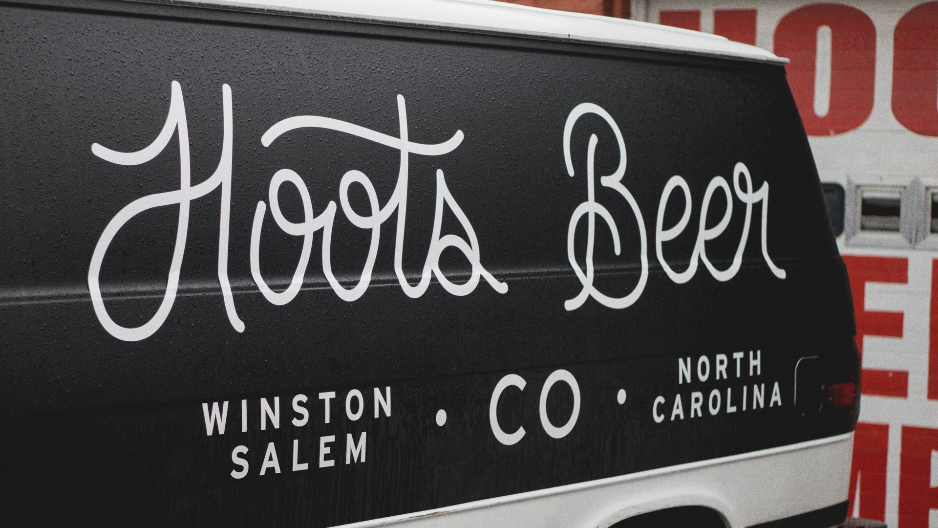
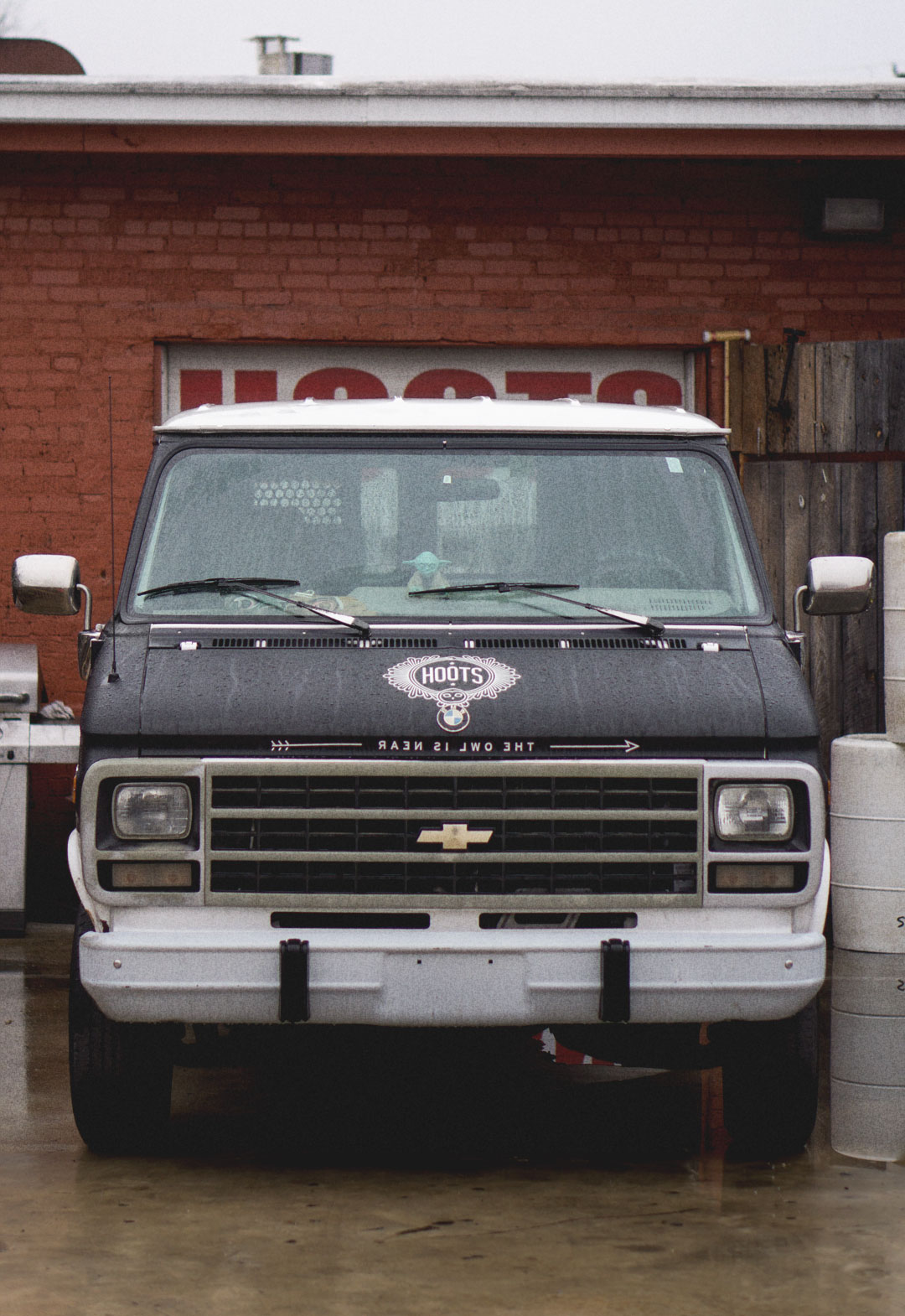
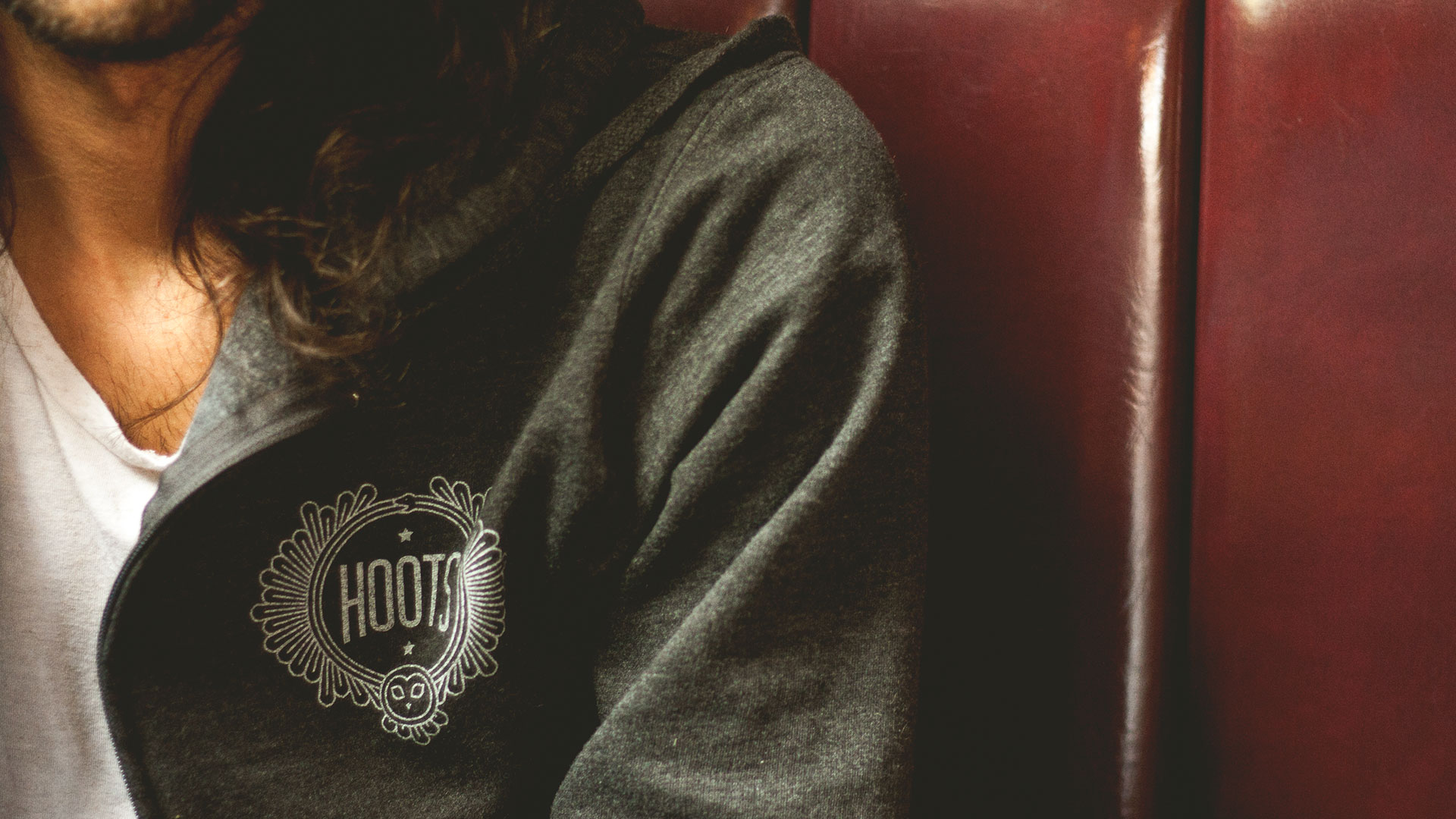
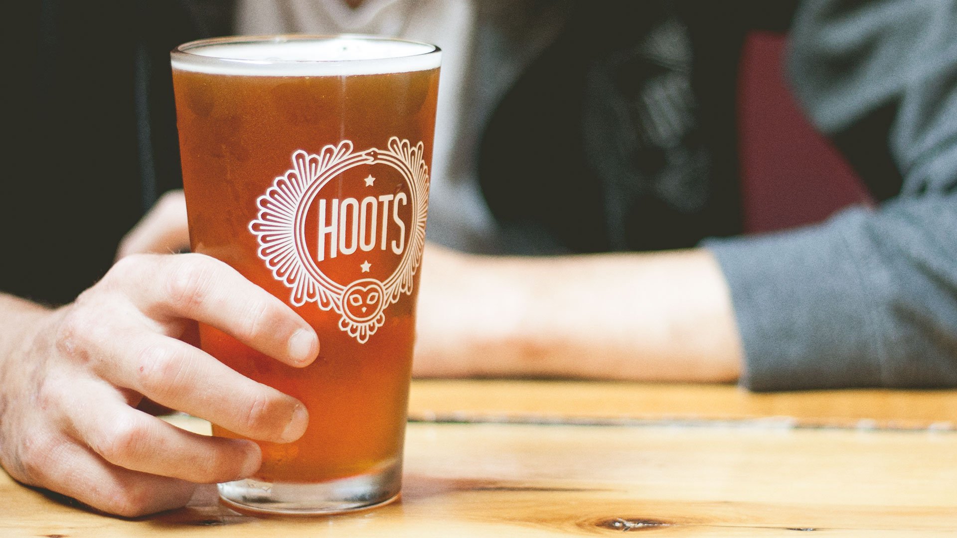
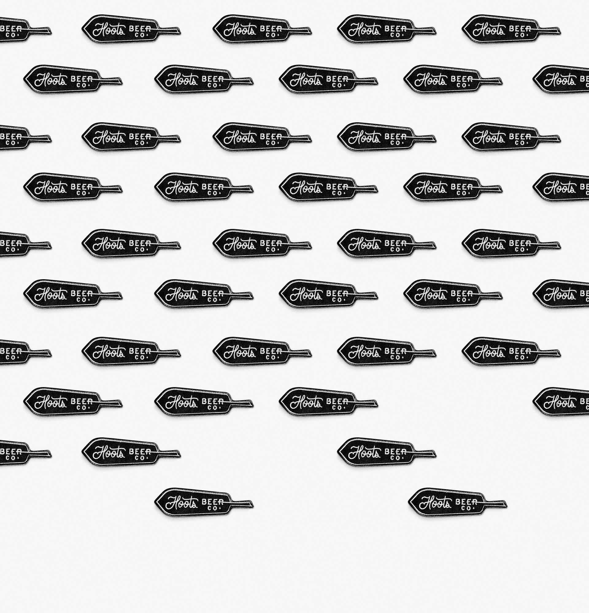
THe Fine people at Hoots are honest hard-working people who take beer seriously and not much else. they needed a brand that reflected that mentality.


